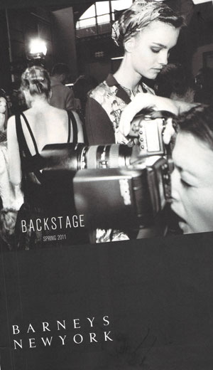
A little while back I got a mailing from Barney’s. Most likely they sent it in recognition of last year’s giddy Narciso Rodriguez LBD. Or an exorbitant tube of Cle de Peu concealer I ran in to replace, but that’s another story. It was a large black and white book, maybe 11×14. Fashion Week for Fall 2011 had just finished, and mysteries of the catwalk were still fresh in my mind.
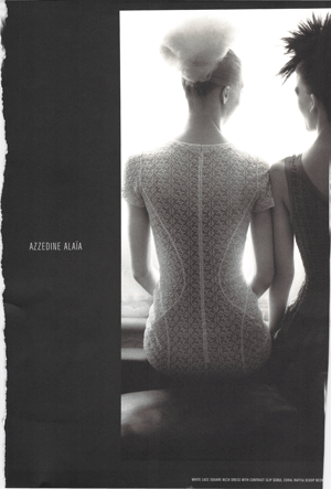
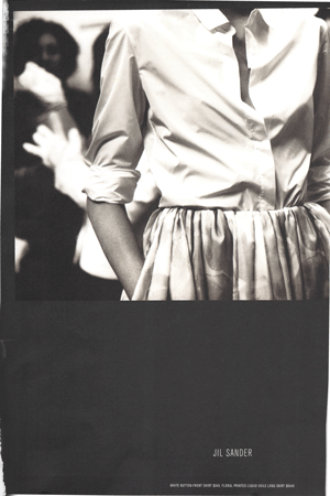
I tore out the pages that I found most interesting, to scan. These are they. Above, Azzedine Alaia. Let’s all chant “Waistline, waistline, waistline.” Louder please. Below, a look I quite favor, and easier to pull off, from Jil Sander. Pockets, even. The dodgy light makes even comfort compelling.
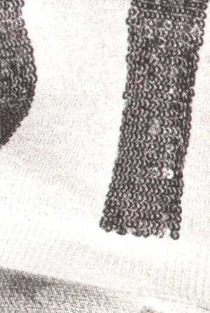
In this day of high-resolution everything, instant online shopping, and relentless wardrobe planning, there’s still room for a little low-fi. When you magnify print beyond useful enlargement, the page turns into what looks like hordes of tiny lamps, flaring and blurring. There’s space between the dots. A very smart CEO once told me that marketing is as much about what you leave out as what you say.
Above, L’Wren Scott, up close. I rarely hanker after her stuff, but black and white print tones this skirt down enough to provoke a happily raised eyebrow.
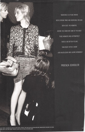
Below, a Chanel-style jacket at Proenza Schuler, skirt under repair. The models appear not to care one whit. I no longer lead a life with occasion or the means to wear clothes like this very often. But doesn’t Barney’s do a good job of inciting desire? More so than many of the full-shine ads in Vogue et. alia?
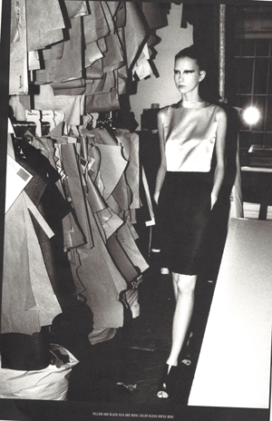
Sideways glances and a yellow and black color block dress. I don’t remember who made it. I don’t even like yellow, or color blocking. But in black and white this looks like a satin shell, which I do like. There’s room for interpretation and the all-too-helpful contributions of one’s imagination.
Evocative. Now that’s the word I was looking for.
Images: All by Barney’s. You can see pictures from the campaign here, online, but it’s not the same.
16 Responses
I love black and white photography; I wish it were as permissible to shoot food in B&W as it is fashion. :)
Is that a REAL waistline? Really? Is it okay to have one again? (How about hips and breasts???)
Looking at these gorgeous ensembles,I desire to have my younger figure again – especially the waistline! What dreamy selections you show us on an otherwise dreary Monday morning!
Thank you!
XO Candy
Oh Miss Privilege, this is *so* perfect for the day, we just finished looking at some old issues of Vogue, and yes (YES), there is ample room for a little low-res imagery in life. :)
Happy Monday to you!
tp
I think black and white imagery looks so very retro…
Barney’s looks very arty and edgy in their choice of garments and design.
Editing and restraint are evident your CEO friend must be onto something.
Maybe their marketing strategy is to take us back to a simpler time like the 1950’s…selling us a dream or a lifestyle.
It’s too bad the prices are so dear:)
Lovely campaign – I like the behind-the-scenes snapshot feel. I’m not a huge fan of L’Wren Scott but Raf Simons at Jil Sander, now you’re talking!
PS Though I agree with Hostess of the HB, it’s a shame the prices are out of reach.
There’s something so *romantic* about these pictures. Barney’s marketing images almost always get me. There’s a certain insider-wink irreverence that’s always present, no matter the product or imagery. Love their makeup department!
What I wouldn’t give for that Alaia dress!
I liked that you picked such vintage inspired pieces. Azzedine took his patterns from Adrianne and that Jil Sanders dress looks like many of the vintage pieces I collect. It’s interesting because I’ve often wondered about black and white and whether it just serves as a pretty moody image or can actually sell clothing. You have written good food for thought :)
xo Mary Jo
Black and white photography is almost always better. I like your evocative choices too. I also would like to have my young woman figure back. I didn’t appreciate it at the time I had it.
I love the photos. So romantic and enticing. Portraits are so much more flattering in black and White. Might have a practice today taking b&w pics with my new camera.
Lisa, have you already been at the wedding? I had a date in April in mind.
The ads in the magazines are the reason why I read tham when I am at the haidresser. The more the better!
Jan – Well everyone knows food is sexier than anything:). We need the full color.
Cand – Thank you! I think that Jil Sander outfit would do just fine for this 50-year old:).
TPP – I hope your Monday was lovely.
Hostess – Yes, could you speak to the Barney’s people for me about the prices? Perhaps set the Glove to point some sense in them?
That’s Not My Age – Our taste is aligned.
Deja – You are exactly right. I hadn’t even articulated that to myself, but that insider thing is SO Barneys.
Princess Freckles – You’d look divine.
Mary Jo – I didn’t even notice they were vintage-inspired, but you are right. I think the black and white may not sell specific outfits, but it does encourage one to head to the stores.
Susan – Thank you. And don’t we all wonder now, why we didn’t appreciate our young flesh in the day?
Chicatanyage – Oooh. Show us how your new camera work turns out.
Paula – April was the RSVP date. The wedding is next month. Stay tuned.
Am at once charmed and reassured by the Sander ensemble. Have been ogling L’Wren Scott locally, how to break the bank and stop traffic at once.
Lisa,
If I thought the glove would have any effect I would put it in action…
Barney’s would probably have me and my glove removed from their elite premises!
Comments are closed.