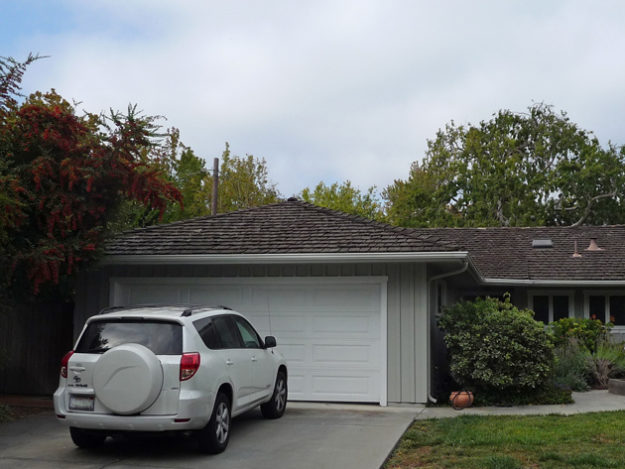
You may remember, we had our house repainted about two years ago. What I haven’t yet told you is that we subsequently began to receive a lot of postal mail that wasn’t ours. Did I understand the root cause immediately? No I did not.
I’ll wait here while you infinitely smarter people figure it out.
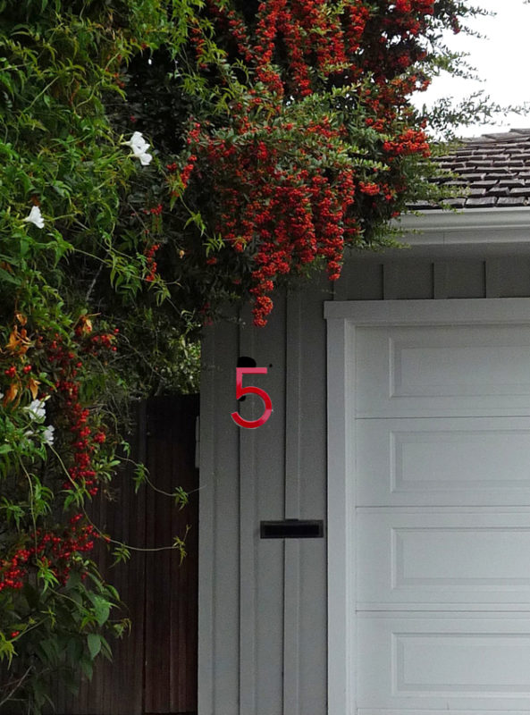
Notice anything missing in the photo below? Under the pyracantha berries, interlaced with white oleander for that one-two midcentury California landscape punch?
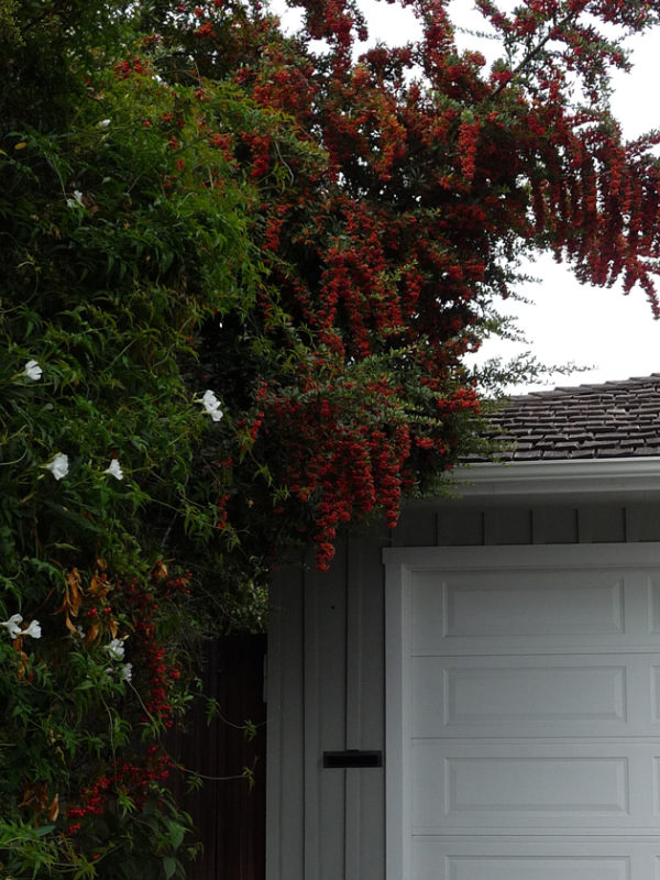
We’d removed the house number and never put it back. To make things worse, our curb stencil had faded almost beyond recognition. Occam’s Razor at work.
But, I didn’t want to put the old one back up. It’s true mid-century-not-everything-was-modern, charmingly retro, and ironic. But suburbs don’t make me feel ironic, particularly. I’ve been looking for a new number.
I briefly considered color. Red, to be precise. A sole numeral, because my address is single-digit. But I put that aside for all the reasons that I eventually chose a black door. Then I thought about illumination, quite techy and appropriate for Silicon Valley.
Nah. I don’t live in a space ship.
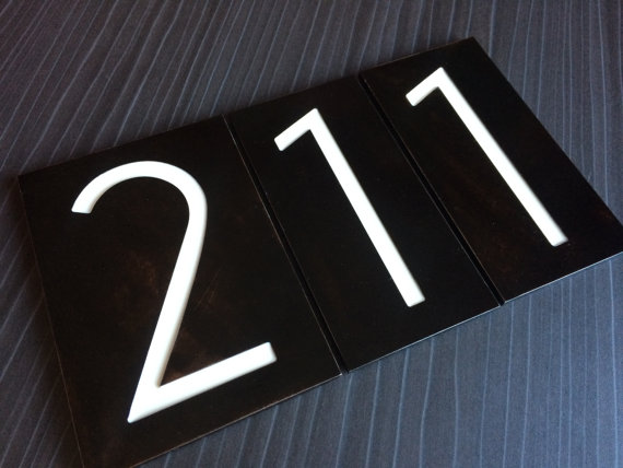
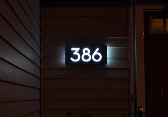
Maybe white, on a black background? Nice, classic, sturdy, but in the end too sedate for my Artsy Cousin dreams.
Our doorknob and doorbell are kitschy, hammered bronze. So I’ve settled on modern, sleek, yes, bronze. Like this.
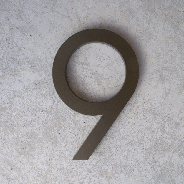
I like the subtlety, the slight sheen, the contrast of traditional shake roof with white trim to modern typography. I’ll see if can be installed “floating” away from the siding, maybe even backlit with a teeny low voltage bulb.
The low-decibel style that I prefer can only be achieved by very small tweaks. Eschew the pop, focus on the crackle.
Now I can receive all those bills, catalogues of things I’ll never buy, and innumerable coupon sheets with which to light our Christmas fire. My neighbors will have to make do with their own.
Has it occurred to you to switch out your house number? Probably. What did you choose, and how? Something more traditional?
Or wildly unusual?
Links may generate commissions
38 Responses
Hello Lisa, I knew that you would hit on the perfect choice–what could be classier than bronze! The style is also clear and readable, unlike those questionable house numbers which make a guessing game out of the address.
–Jim
@Parnassus, Thank you! High praise indeed from a connoisseur of the classic!
Our postal service will not deliver any mail if there are no numbers on the house!
@Bungalow Hostess, So disciplined of them!
In rural Colorado we are required to put our numbers on the house for EMT calls. Because the road in front of my cabin is actually a public easement on the neighbor’s property (our property lines adjut, but the 20 foot edge is easement.) he has decided to put his numbers next to ours on the same tree. It’s “his property” and he doesn’t want the number on his house in case “Obama comes looking for me”. I removed it once, he called and complained, finally I just put arrows pointing to the respective houses to clarify. He DOES plow that road in the winter so I pick my battles.
@Nelson Bartley, Hahahaha! Weird neighbors are weird neighbors everywhere, it sounds!
Perfect. Has it all!
@Sandra Sallin, Thank you!
Our city (University Park) has an ordinance which requires house numbers ON your door! So–we decided to match the finish on our door handle–which is pewter. We place the numbers at the bottom of the door.
@Susan D., That sounds cool, numbers at the bottom of the door. Almost like the page of a book.
I love that bronze number – that font is beautiful! We don’t have house numbers. No one ever sees our house – we’re set so far back from the road. Our mailbox is numbered (ugly – we repainted 2 years ago but it needs it again…) and I think somewhere there are reflective EMT numbers set in the shoulder, but…..Country living!
@Kelly, Thank you:). And, country living:).
I did a search but gave up a while ago. Our house number includes a letter and I couldn’t find a font I liked for both :-( Maybe I should take up the search again.
@joannawnyc, There’s an awful lot of choice on Etsy, for example.
Alas, after searching, I wound up with standard brass numbers from Home Depot because the house painter was waiting on me so he could put them up. At least now, the EMT can find our house. We did switch from putting them on the front porch post to above the garage door because it was easier to see. I love what you chose.
@Jane, Thank you. And nothing wrong with standard – sometimes it’s the best option.
Bronze is perfect on your house color. Draws the eye nicely. When I renewed my house number I chose brass, 6 inch tall numbers (126) adhered to a dark brown wood oval. The brass on dark brown contrast is eye catching. My home is very contemporary.
@Susan, Interesting, brass on oval is often more traditional, must make a nice contrast.
Hi Lisa, The bronze in a mid-century font is PERFECT!
Smiles from Charlotte Des Fleurs
@Charlotte Des Fleurs, Thank you!!!
Bronze is perfect! I can’t change the house number. One of the requirements of my neighborhood is that all our mailboxes and all our house numbers be identical in color, form, style and location. Little boxes with fancy numbers. Oh well.
@Mardel, Ah, yes, I imagine that had my neighborhood been built more recently the same would be true.
I also needed new house numbers after painting our house, and it also took me two years to accomplish. I ended up buying my numbers from Etsy, and I’m really happy with what I have.
@Nancy, Etsy is a wonderful resource for this. You can get someone to do something custom if you really have a vision.
We don’t have numbers around here , just names , & deciding on a name board is an even bigger task . I like your number – Art Deco ?
@Wendy in York, A name board, yeah, that’s a biggie! And I don’t know quite how to characterize the font of my number. Hmm.
We need a new number too!! I hate our number…single digit as well but it’s ugly. Also perched on a narrow front porch rail (not wide enough to be a column) like an after thought. Haven’t made any progress though. East coast but going for cottage by the sea look – front porch, dormers etc. will need to address color for reprinting soon..
@JB, Finding the right number could be really satisfying.
You done good!
@Lisa, :)
I have black iron ones on white house. Postmen seem to ignore it (most houses have blue tables)
Dottoressa
@dottoressa, Sounds hard to ignore black on white but postmen must have their own code;).
Ah, mail delivered to the house. . . I remember that, but we’re talking three houses and two cities ago, back to when we lived in a small (17,000) northern city a 90-minute drive from the nearest small town. . . Since then, we’ve walked to the corner communal mailbox to pick up mail. . .
Now, we’ll just be riding the elevator downstairs to the lobby, and we have neither responsibility nor choice about address signage.
But we carried along the sign that came with our last house — before we bought and reno-d it, our place was rented for a few years, and apparently served as a gathering spot for some of the island’s stuck-in–the-60s folk. Some talented soul with some wood-routering skills grooved deep letters into a large wooden plaque with the house’s hippie-assigned name: Rave-Inn. . . We’re debating whether there’s a nostalgic spot for it in our new condo. It would definitely soften or rough up the crisp, urban edges of the contemporary architecture. . . .
Your bronze numeral, on the other hand, is entirely tasteful, of course, and makes a handsome addition to your place. Well chosen.
@Frances/Materfamilias, What an excellent story. I hope you put that sign out on your patio. No need to grow cannabis below, however;).
Very nice, I do think I would go ahead with the small black light in case someone needs to find you in the dark. We have traditional house numbers like the ones you show further down in your post. My father had a foundry in his retirement and poured them for us so I may even take them when we move out of the house because there’s something that he made me.
@Roseag, That’s lovely, to have them poured in fact by your father. I’d definitely keep them.
We have a carved wooden oval house plaque with the number in gold leaf…..except now our door hardware is nickel, dammit! I have to find someone with a steady hand to silver leaf the number and the outline of the oval.
@Patsy, Dagnab it! Is it sheltered from weather? The gold leafing I did to a planter outside has pretty much washed off;).
Comments are closed.