You may have known from birth how you feel about color. You always chose ochre, or marine green as your favorites, never blue. Your enthusiasm informed your wardrobe, and eventually, your house.
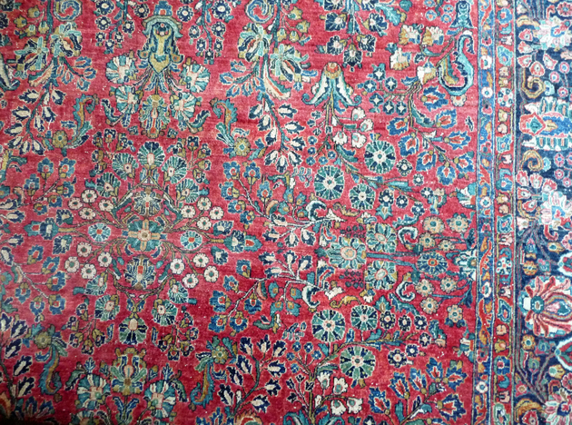
Rarely so for the Sturdies. Color, other than The Old Red, White and Blue, often scares us. Lucky break, denim’s blueness and all. Just once I bought a hot pink linen blazer. So when it came to furnishings, I got help. Mom furnished my first apartment, a Central Park West studio, at Macy’s Manhattan. There was room for one brown couch, a peach/celadon/ sand Chinese rug, a brass bed, and an English mahogany chest of drawers from my father’s family.
It was a sort of home.
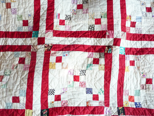
For my second apartment, the co-op at #8B 320 Riverside Drive, I worked with Janet Liles. She is still a New York designer. Imagine a white-walled bedroom with red accoutrements, antique rug purchased in then-remote Brooklyn, antique quilt, planter. Good feng shui, who knew? She ordered me new custom living room furniture, a rosy beige velvet sofa, sand-colored Thai silk chairs, peach duppioni silk ikat cushions with a fuchia fleck. Gorgeous.
All of which got worn to shreds. When the kids came we reupholstered more sturdily.
As I have said, after my divorce, I Pottery-Barned big time. Peanut faux suede, espresso wood and leather everywhere, as though I longed for nutty baked goods and a cup of coffee which I did not.
And now I’m redoing my interiors, determined to have (for the first time since the CPW studio) a fully-furnished grown-up space. I have a different kind of help this time in Emily Henderson’s eponymous blog. Accessible, quick-moving, her approach has increased my confidence, as Nancy Braithwaite’s book did. (I’ve ordered Emily’s book too, Styled: Secrets for Arranging Rooms, from Tabletops to Bookshelves, but it sold out in a month, backordered. I’ll review it when I get it.)
Turns out color can be found everywhere. Anywhere. I’m learning how to choose without the experts. Look. Look until your eyes see instead of your mind. The color soaks in like water to dry ground. Takes a while to absorb, even longer for anything to grow.
For example.
Glorious Color From Rarefied To Right Next Door
Miles Redd for Schumacher
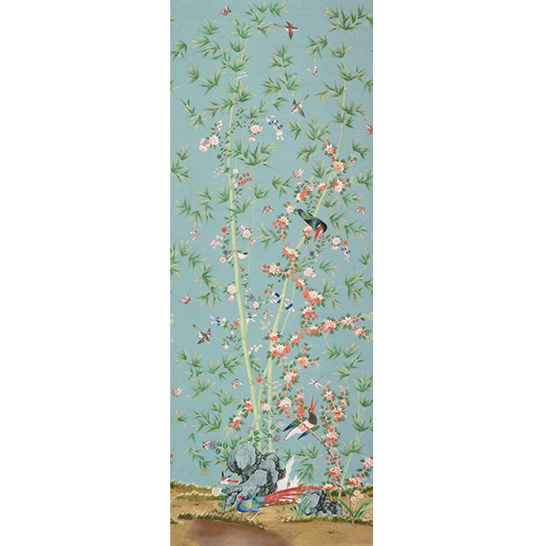
Mrs. Blandings introduced me to Miles Redd and his new collection for Schumacher. Let’s all fall down from beauty. She likes this.
Me, I imagine the birds in blossoms below covering a chaise longue. Except, the pattern’s got a 12 foot repeat, which means that unless you’re making curtains for your 12-foot high ballroom some of the glory might be lost? Tempted anyway. Pricing will likely dissuade. Thoughts from the experts?
Cost Plus World Market
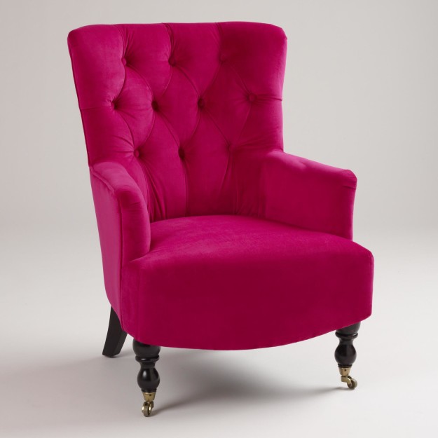
Which brings us to Cost Plus World Market. To be forever be remembered, in Northern California at least, as a source of Tiger Balm and illicit teen forays. Recently I wandered into one of their stores and took a look. While you could start small with their throw pillows, they’ve got good ones, I loved the arm chairs. Again with the birds, branches, blooms.
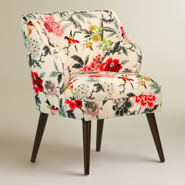
The jewel toned velvet arm chair, noticing my enjoyment said, “Well my goodness little Sturdy Gal, change comes to us all.” The peacock versions murmured in assent.
The Grande Dames might endorse transparent acrylic legs?
Fear banished, planning begins. In my future, a trip to the San Francisco fabric showroom. A chaise longue for the guest room, in what, red and black? Aqua and cream? Succumb to Schumacher? I rub my hands together.
I have never before looked back at my life as a series of color choices. It’s like snapping filters over old photos. Recite. Brown, red, rosy taupe, brown, aqua, pink. Does the history of colors in your house reveal anything to you? I haven’t yet extrapolated any meaning yet, only just noticed there’s a story at all.
Sponsored by neither Schumacher nor Cost Plus World Market. Affiliate links may generate commissions.
50 Responses
I wear all solid neutrals, with the exception of blue – but in my home I use a lot of color and pattern. I was an interior designer for many years, and perhaps I have more confidence (and frankly interest) in that area, rather than fashion, where I’m more comfortable in a “uniform” because I’m a bit lazy about dressing. All the women in my family are/were this way. Love those Cost Plus chairs!
@Kathy, I notice a lot of artists and designers dress very simply. Glad you like the chairs – I was so surprised to see them in Cost Plus of all places!
I am probably your most boring reader. I mostly wear neutrals. We recently had to replace living room furniture, husband and I walked into a store, spotted a grey sofa and went from there. I do like blue in home settings and I occasionally wear green. Still, although I like what you’ve posted, can’t imagine it in our house.
@Mary Anne, Not boring in the slightest.
I love the Cost Plus chairs too–but what of their quality? I say choose what really makes you happy. Will your husband have an opinion?
Take a spin through Pinterest to find the rooms you like the very best. Right now, I am loving Robert Kime fabrics–but I’m sure the price on his designs is hefty.
I do love color and pattern, even though my current home would deny that.
@Susan, Interesting that given all your interior skills you don’t live with color or pattern. I am guessing you like neutrals too? And the quality of the chairs, in the long run, I can’t know. They certainly looked great in the store.
Yes, I do like neutrals, and our house in Dallas and our farmhouses are mostly neutral with pops of subdued color. BUT, I really love a bohemian style with lots of color. Since I tend to like furniture and fabric with very high price points, I err on the side of practicality for the long term.
I wear mostly black white and grey accessorized with printed scarves.
Our Humble Bungalow has its own agenda as it is a heritage designated home. We use organic earthy tones, mostly greens. The dark wood, mica shades on the lamps all compliment the quarter sawn dark oak furnishings…most of which are original arts and crafts and mission style antiques.
If I ever move to a condo I will embrace white and teak and large scale paintings in bright colours.
Isn’t it fun feathering the nest?
I am interested in your thoughts on the book. Hope it arrives soon so that you can review and share it with us.
@Bungalow Hostess, So much fun! And I can imagine that after years in the Craftsman bungalow, next time you’d go all white and bright and high in the sky. I’ll be sure to jump on the book review, I promise.
Most of our furniture is inherited, in the color/style I guess could be called Modern Mushroom and we’ve been too timid to do much or add color. Someday….
@Susan (une femme), Hahahahahaha! Modern Mushroom! I wonder if retirement will find you too suddenly looking around at your house and thinking, “Wait! This is like clothes, but you can invite guests in!”
And you know there’s an online 25% off + free shipping deal right now on those pink and peacock World Market chairs, yes? Can’t quite tell for sure, but the peacock color looks like it would be a roaring success with the “red rug” shown in your first frame. You might even consider a pair of those peacocks [for which the customer reviews were stellar].
@TheHuntingHouse, I know. I saw! I have no room in the living room for chairs right now. But the guest room – I mean, I could get an ottoman and put it with the chair…
I’ve been eyeing those printed chairs from World Market too. I’d like one in a guest bedroom to create a private space so guests can tend to their email and such without setting up shop in the living room.
They look nice but I wonder they’re comfy enough to keep a guest using them.
@RoseAG, I sat in one in our local store, it was totally comfy enough. With a cushion and an ottoman would be even better.
Well, this is a thought provoking post, indeed! I’ve not ever considered why I pick certain colors to live with, but now I shall go away and think on things a bit further.
When I moved here from England, I enjoyed the calmness of having paint on walls. We were used to wallpaper from birth over there, lots of it, with much pattern. I approached paint meekly and mildly at first (boring beige), but developed a liking of stronger colors as I grew more confident in what I was doing. Natural light factors into a lot of things too as here it can either be very bright (glaring sunshine), or very dark (with the fog). So, I suppose for me colors are a reflection on what is going on in the outside world more than anything going on inside of me personally. Not sure if that makes sense or not.
@Chronica Domus, Yes, that makes total sense. I suspect you are comfortable with color by now, and so have moved on from internal reflections to external.
Interesting. We’ve often had to live with strong colour choices already in place — an orange rug in the first house we bought (we were 23 and 27, thrilled to afford the house’s modesty, and happy to rally ’round the bright), fabulous blue cupboards (marine paint, indestructible, ‘tho the kids tried!) in our last house. But we’ve tended to keep the walls fairly neutral, I suppose in compensation, until this place.
Here we have terra cotta tiles and fir floors, with Benjamin Moore dill pickle green walls, and in the winter the (Ikea, velveteen) curtains are pumpkin-coloured. A leather club chair each, one in burgundy, one in deep forest green, because that’s what was on sale when we had the funds, one at a time. . . A snuggle of cushions in fall jewel tones. . . so. . . not neutral, I guess. Although I love rich, luxurious, taupe-y neutrals in other’s minimalist spaces. . . . Really interesting question you’ve posed and I’m loving reading everyone’s responses. Thanks!
@Frances/Materfamilias, So that’s super colorful, whether by accident or on purpose, and all in earth/ocean tones, how fascinating!
Wanted to add that your rug and quilt are both beautiful. Also, that I know you’re looking for a nightstand to “match” the one Federal one you have from your grandmother, but it might look nice to have something else on the other side, antique style, but maybe a small chest or writing desk.
@Kathy, Thank you! The reason for the “matching” is that nothing else in the room does, except the black Pottery Barn bed and chest of drawers. I have a white wood with turquoise stain hope chest, a red patterned duvet cover, etc. I’m still mulling over how to add some cohesion without getting that “store-bought” look.
When I wish to hide, I’ve embraced vivids. And when I’ve wished to display, I’ve loved black and white–almost exclusively. I’ve never found myself attracted to neutrals. Greige be damned.
but I was actually thinking about this just this morning. I was thinking how much I dislike warm shades of colors. I love red and orange and yellow, as long as they have a strong presence of blue in their formula. Very interesting topic. On Faux Fuchsia a few posts ago, a little discussion about orange came up. Love hearing/reading perspectives on color.
@Stephen Andrew, Hiding in vivids! Who knew? I’m still imagining what that would be like. And, I’m with you, I need blue in my colors, somewhere.
@Stephen Andrew, oh I feel there’s no better camouflage than a barrage of aggressive color!
I want that pink chair with every cell and fibre of my being!!! Mr FF chooses all the furniture art objets etc in our old Queenslander home. He favours French antiques, velvet sofas and modern Australian art. It’s colourful and beautiful.
I find strong colour very cheering, esp during life’s awful times xx
@Faux Fuchsia, I just realized. If I had to vote for one blogger to build their own lifestyle brand it would surely be you. Pink chairs front and center.
Oh color in the home, one of my favorite topics. Last night I was lying in bed remembering a very large entrance hall I had in my last rental apartment. It had tall windows, deep moldings and a black and white checkerboard floor.
I painted the walls chartreuse, a friend made me perfect box pleated black and white check valances (which hang in my kitchen today),I paired them with white roller blinds and added an old red table with wonderfully bulbous legs.
It all worked. And at Christmas I piled mercury glass balls in all colors, including turquoise on the table.
Now that was fun.
xo J
@flwjane, It sounds amazing – audacious to say the least. I believe you that it worked, and I am trying to imagine what it would be like to live in that space for a long period of time. Just imagining it is good for me:).
My sense is I can’t go wrong if I veer toward the colours that are the hues of wear and time, the faded Italian grotto red, the wistful ochre, the green of old copper, the blue of deep seas. It is when I get into the fizz of lime and hot pink that I’m in trouble. Those colours are sexy as the rhythm guitarist in a bar band, but I can’t live with them.
I was brought up with a palette of “tasteful” gold, beige, and ivory and it is like aesthetic novocaine, to this day.
@Duchesse, “Rhythm guitarist in a bar band,” ha! How many of us have succumbed to that or something similar;). I am trying to find words to describe the colors I like in my house, but I cannot yet. I hope it will come. Sounds like you’ve got yours down.
My husband would probably prefer white, but no, I need a palette of yellow, greens, and blue in my house. Every house I’ve lived in has had at least one yellow room. Happily, the house we bought last year had all my colors already in it! We will repaint at some point, but for now I’m very satisfied with the imposed choices. By the way, when I was choosing fabric for bedroom curtains, I noticed that bird prints are very big right now. I’m quite intrigued by the 12-foot repeat fabric. Off to find out more about it.
@Sewing?obrarian, That’s so wonderful, that you have a yellow room accompanying you everywhere!
I love colour in my house. I’ve painted the walls fairly bright colours, thinking if it didn’t work I can always paint over it easily. My kitchen has orange glass tile backsplash, my living room is a yellow with a hint of green, bedroom a blue grey etc. It would be nice to try that purple shade you mentioned a while back with my grey tile bathroom. My place is probably not as bright as Faux Fuchsia’s but no white or beige walls for me.
@Northmoon, Orange glass tile backsplash! That is the choice of someone really comfortable with color, someone who probably does even need it. Sounds amazing.
You have a lot of interesting theories!
Love the Cost plus chair,rug and patchwork quilt.
I started with pistachio green,than had red dining room,then blue-dove grey flower sofa and chairs ( after red!,not together).
Now,black leather,black wood,oak floors,cream carpets,lot of colourful cushions,lot of light,white kitchen with ,here we are again,pistachio green glass wall.
I don’t wear pistachio,if you are asking
Dottoressa
@dottoressa, Theories ‘R Us! And your current inteior sounds beautiful, so modern and clean.
As a former designer I could go on for days. In my current house I made a hasty decision in our family room and must now live with very expensive curtains (on 4 windows no less) that I don’t like. My idea was to use bold feminine color. After a while it began to feel garish to me. I have always had a grey sofa in the room and one day I put away most of the colorful things and bought neutral pillows and I am much happier. Our walls in much of the house are SW Repose gray mixed at 75%. I think the large and/or expensive stuff is best in one easy color. Darling floral chairs in guest rooms do not count.
I am rather fearless about color in general but find I prefer either the lightest or darkest of a shade and only a few little little things that are brightly colored in a given space. Oddly, I dress mostly in black and white with a bit of pink in the summer.
Also, there are some great fabric discounters on the web that can take a bit of the sting out of high end fabric purchases. House-fabric.com comes to mind.
@Kerry Steele, “I think the large and/or expensive stuff is best in one easy color.” I will have to think about this as I do the guest room. I kind of wanted a statement upholstery, but maybe that’s foolish. I find that the decisions I make hastily are poor ones, the decisions I let settle are much better. Probably due to my inexperience.
@Kerry Steele, @Lisa, I think statement upholstery is fine but you you must be ready to commit and keep other things in the room simple. My issue is committing to one, expensive bold thing. I spend less money when I choose bold accessories and feel no guilt upon changing them.
have always used oriental rugs as take off points and have gotten more brazen over the years about colour. The furniture is Federal and Regency antiques with a healthy dollop of contemporary lighting, which keeps it from looking like a house museum; also with all sorts of “stuff” on surfaces, some precious, most not. Reupholstering antiques using rather more contemporary fabrics. Mostly though, it’s what pleases me (and having a spouse who is happy with most of what I do)keeps it all fun. That being said, I also wait until I can have what I want so there are very old curtains in the living room which will have to wait until…..who knows when. Always a work in progress……but important to have fun with it, I think.
@barbara, Oh man that sounds GORGEOUS!
I would love to send you some photographs of my house and how it has evolved. (if you are interested email me)
The house was featured in a magazine a few years ago, but I cannot find a link to the issue on the internet. I am not a professional decorator or designer which made the experience of being selected for a magazine all the more unique.
Here is the mantra for decorating and color selection:
Be brave and unafraid with color. White walls show no imagination!
If you have something that brings you pleasure, use it or display it.
No over head lighting. Lamps with cool bulbs in approximately each corner of the room….etc.
Sorry to babble on so. Enjoy the opportunity for color, texture and balance to shine! Be creative and follow your instincts.
@Carol, Yes, absolutely, I’d love to see it. I’ll email you, or you can email me at the skyepeale yahoo mail address that’s in the sidebar.
@Carol, “I would love to send you some photographs of my house and how it has evolved.”
I want to see them too! Oooooo, wait a minute, blog post idea: readers email house pix to Sky Peale, Sky curates a Privilege Readers House Pix post. Good idea/bad idea?
Really cool idea.
It’s an interesting conundrum, what you choose regarding color versus what chooses you. When the mister and I got together 10 years ago, he arrived with rugs inherited from his father, an intelligence officer who had worked in the Near East in the 50s and 60s (doing I really don’t want to know what, but the rugs are beautiful). We made a conscious choice to keep and foreground them, so the furniture is very neutral for visual balance: cream leather, mid-tone woods and some tonal prints, mostly MCM and some antiques. The pillows are made from kilims and Asian needlework, to bring the rug colors up to seat level, and the walls are taupe, cafe au lait and a pale slate blue (because I have to have a blue bedroom) so they don’t compete with the (fair amount of) (very eclectic) art, which brings the same reds and blues and some secondary colors to eye level. So there’s a fair amount of color, but it’s visually spaced horizontally and thus not overwhelming. I think.
@maryn, Yes, sounds beautiful. I am mulling over the concept of spacing out the color horizontally, like a drift of plants in a garden bed.
Ooh, I can’t wait till we have a house to decorate again! We’re in the painful waiting stage in the house-buying process.
I’m so looking forward to working out what we can do with a Victorian terrace an a limited budget. We’ll probably have to live with the 80’s pinkish terracotta carpet and the white, blue, mustard and brick tiles in the kitchen (I do hate the tiles though). The similar tiles in the bathroom will go post-haste as they’re mouldy.
In terms of history, as a little girl I was all about a pink bedroom – my mother made it a subtle creamy pink with a lovely rose printed frieze.
As a teenager and into my early 20s I was all about forest green and actually ended up with a forest green turret room for a bit.
My first house was built in 1980 and we had to live with awful blue carpet so we toned it down with cream and mushroom colours. We did have eggplant coloured couches which didn’t swear too much at the carpet.
Next house… who knows? The fun begins!
@Eleanorjane, Very exciting for you guys! I hope you have so much fun, and let us know what you do!
Comments are closed.